Pharmaceutical branding across languages and markets.
ZANOFLU was developed for an international pharmaceutical business launching an antiviral treatment for the prevention and treatment of influenza.
The challenge was creating a professional brand identity and product communications that worked seamlessly across both English and Chinese markets.
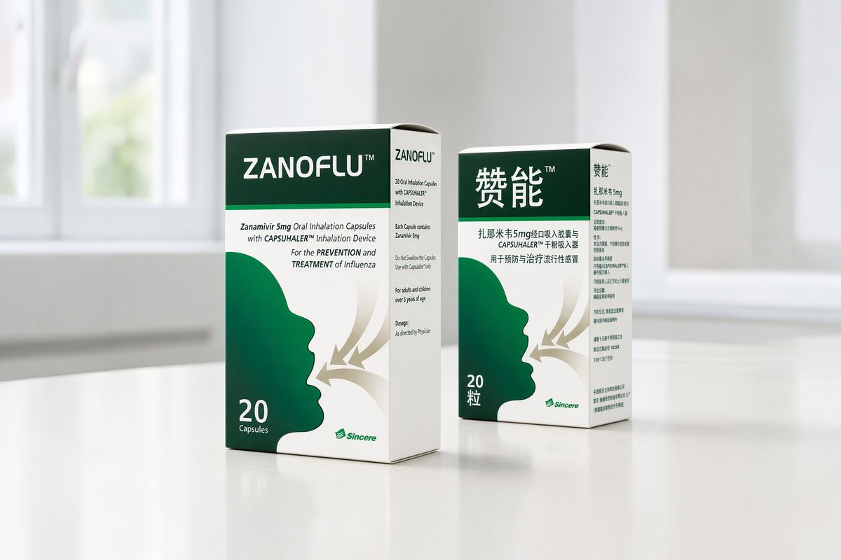
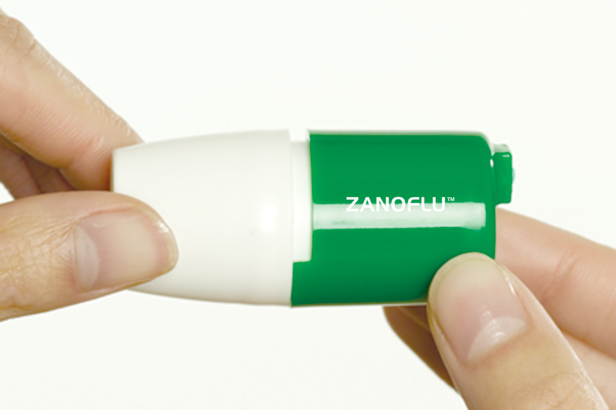
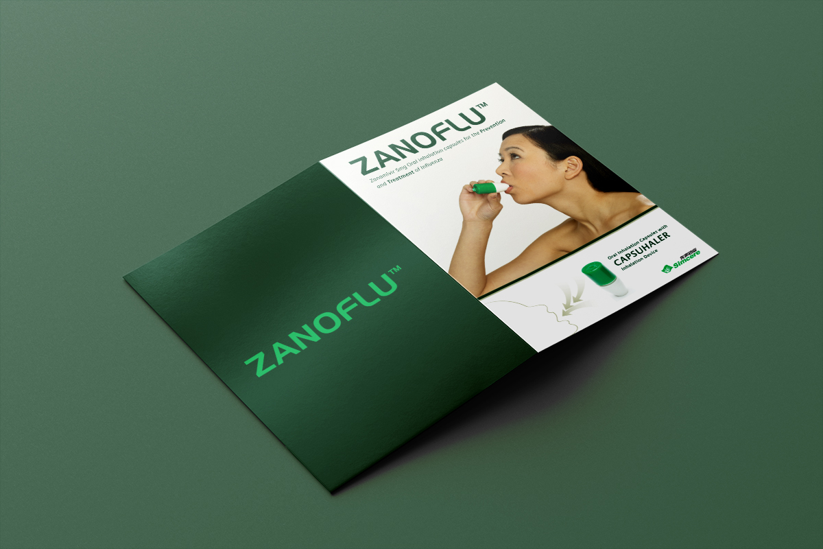
Signal designed the complete visual identity, including the logo, pharmaceutical packaging designs, patient information leaflets, brochures and product literature.
Every item was carefully designed in bilingual versions to accommodate both English and Chinese while maintaining a clear, consistent brand across every touchpoint.
Designing for two languages required more than simply replacing text. Every layout, hierarchy and graphic element had to remain balanced, legible and professional regardless of language, while also communicating detailed clinical and product information clearly.
Signal art-directed the product photography and managed the model shoots to ensure the visual style remained consistent across every application.
By working with Signal as a single creative partner, the client created a cohesive pharmaceutical brand spanning identity, packaging, photography and healthcare communications that could be applied confidently across multiple products, formats and international markets.
The project demonstrates Signal’s experience in pharmaceutical branding, healthcare packaging design and multilingual healthcare communications.
Client testimonial:
Signal created a truly flexible brand that works consistently across our packaging, literature and bilingual healthcare communications.
See more Healthcare & Aesthetics case studies →