
Creating a distinctive brand with shelf presence.
Disproof was developed as a premium non-alcoholic botanical spirit with an ambition to stand apart in a fast-growing market.

Disproof was developed as a premium non-alcoholic botanical spirit with an ambition to stand apart in a fast-growing market.
The challenge was creating a distinctive identity that communicated the product’s vibrant personality while allowing the drink itself to become part of the brand experience.
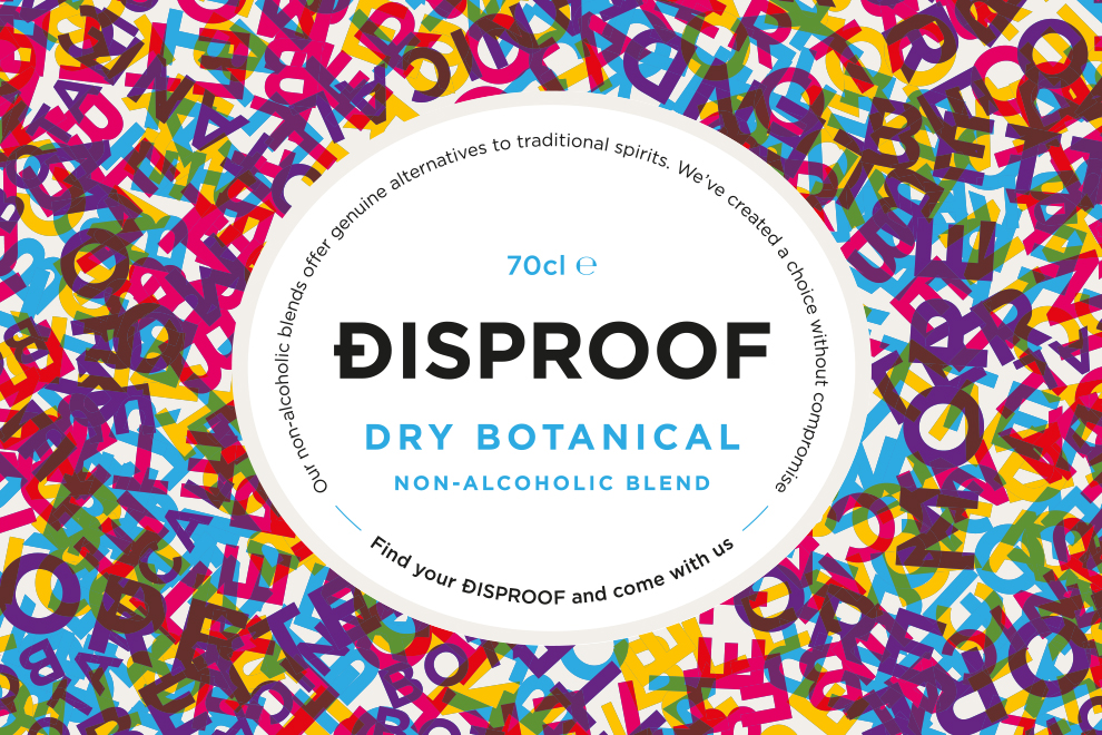
Signal developed the complete brand identity, including a bespoke D monogram, packaging, website, product photography and launch materials, creating a cohesive brand across every customer touchpoint. Rather than hiding the product behind a conventional label, the identity was designed to make the botanical blend itself part of the visual brand.
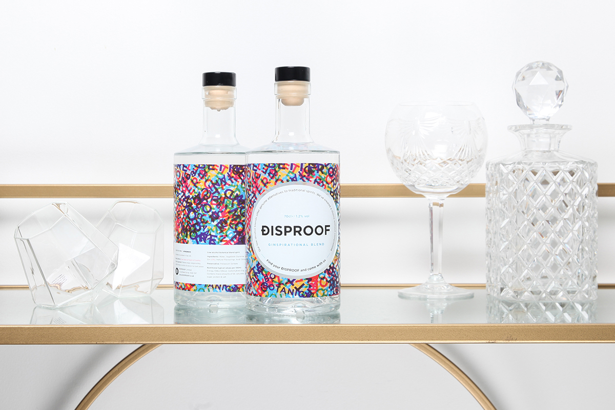
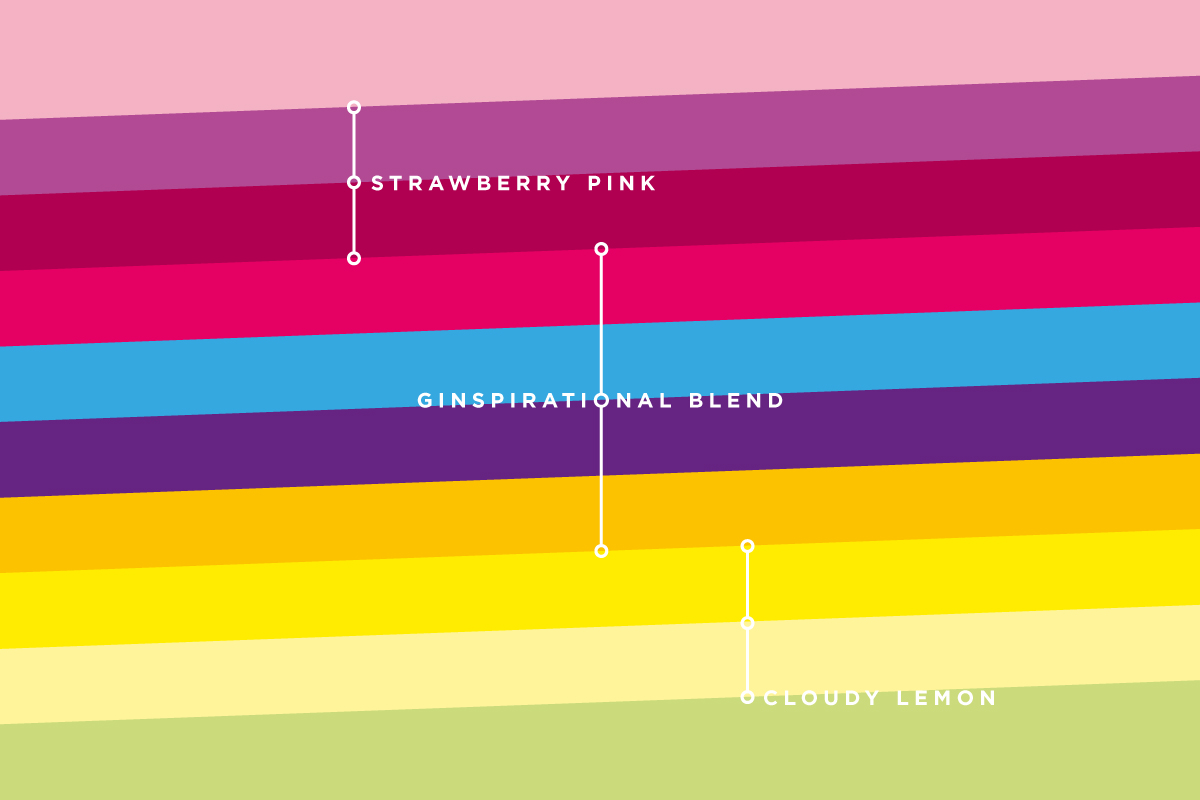
The centrepiece of the identity is an innovative translucent label that allows the colour of the botanical blend to show through the design. Layers of vibrant typography create a stained-glass effect in the light, giving the bottle a unique presence on the shelf and in photography.
The overlapping typography layers together words that celebrate the benefits of choosing Disproof, creating a vibrant visual language that is instantly recognisable while allowing the drink itself to remain visible through the translucent label.
Client testimonial:
Keith challenged our thinking in all the right ways and created a brand that feels distinctive, memorable and true to our vision.


 A clearer starting point
Before creating anything, we like to understand who you are, where you're heading and what makes you different.
BriefWrite is our AI-assisted pre-brief tool, designed to help you organise your thoughts, clarify your objectives and create a stronger brief before our first conversation. It takes around ten minutes to complete.
Prefer to talk directly? Get in touch.